Close


PrepInsta Prime App
Industry
EdTech, Career Prep
My Role
Product Designer
Deliverables
Mobile App
Creative Direction
View Product
10M+ learners were on the platform. Most couldn't find where to start. Here's how we fixed that.
PrepInsta Prime is a modernized coding preparation hub built for placement interviews - mock tests, practice tracking, interview prep, and roadmap guides, all in one place. The content was strong. Getting to it wasn't. This is how I redesigned the app around one goal: help a learner walk in, know exactly what to do next, and stick with it.




10M+
Learners served through the platform

2.25L+
Placements recorded

4.8/5
App Store rating
The problem wasn't the content.
PrepInsta Prime already had the thing most EdTech products spend years trying to build: real content, at real scale — coding practice, placement preparation, and certification programs used by millions of students preparing for interviews.
What it didn't have was a mobile experience that respected how someone actually uses a prep app: in short, scattered bursts — a few minutes between classes, late at night before a placement drive, in the back of an exam hall queue. Users needed a way to quickly discover the right course, see their own progress at a glance, and stay motivated enough to come back tomorrow.
That's the brief I designed against: structure, personalization, and momentum.
Three moves. Each one earned its place.
I designed the PrepInsta Prime app experience around usability, personalization, and learner engagement. Rather than redesigning everything at once, I focused on three specific layers of the experience — each solving a distinct part of why learners were dropping off.
1.
A clearer information architecture
Rebuilt how courses, modules, and paths relate - so learners see their track and what's next, not a flat list of 200+ courses.
2.
Better hierarchy on course pages
Curriculum, benefits, and actions clearly separated - starting or resuming a course takes one glance
3.
Improved navigation patterns
Reworked how learners move through the app to get to learning resources faster - fewer taps between "I want to practice" and actually practicing.
Design Showcase
A look at the full app experience - onboarding, course discovery, category pages, course detail, practice and mock tests, profile management, and the Prime paywall.
Onboarding Screen
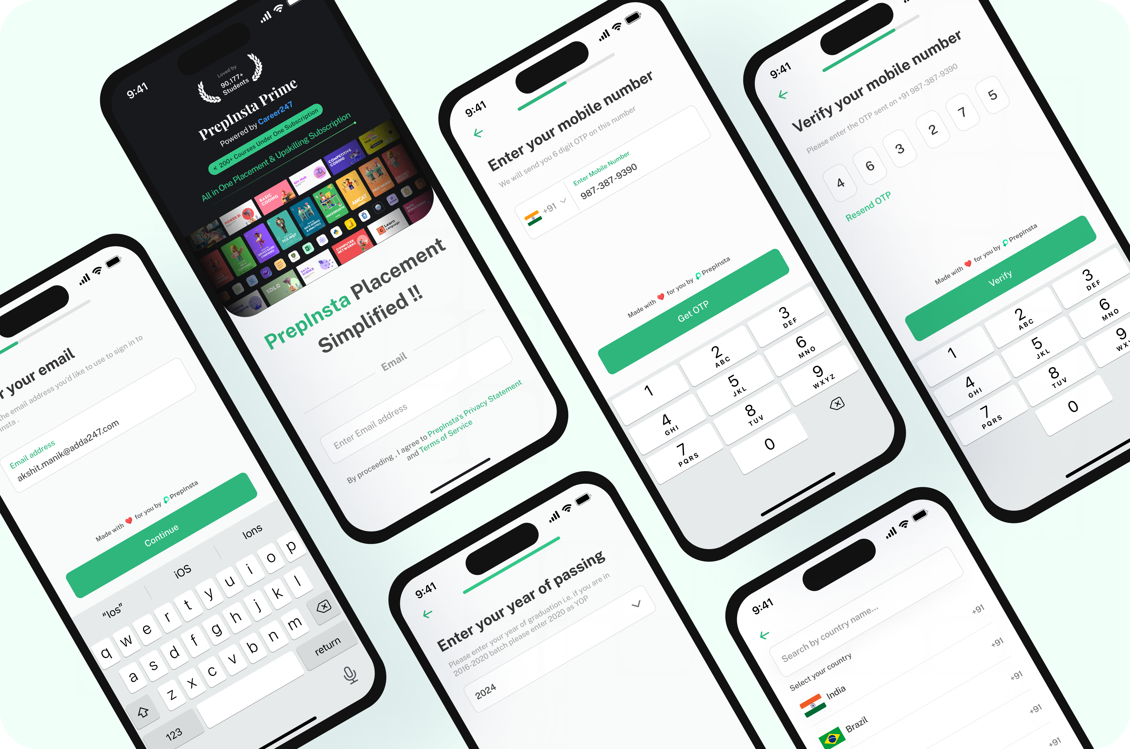
Getting a learner to their first course, faster
Designed first-run flow - email sign-in, mobile number verification, and a short profile setup (year of passing) - so a learner reaches a relevant track in a few taps instead of landing on an empty dashboard.
Course discovery
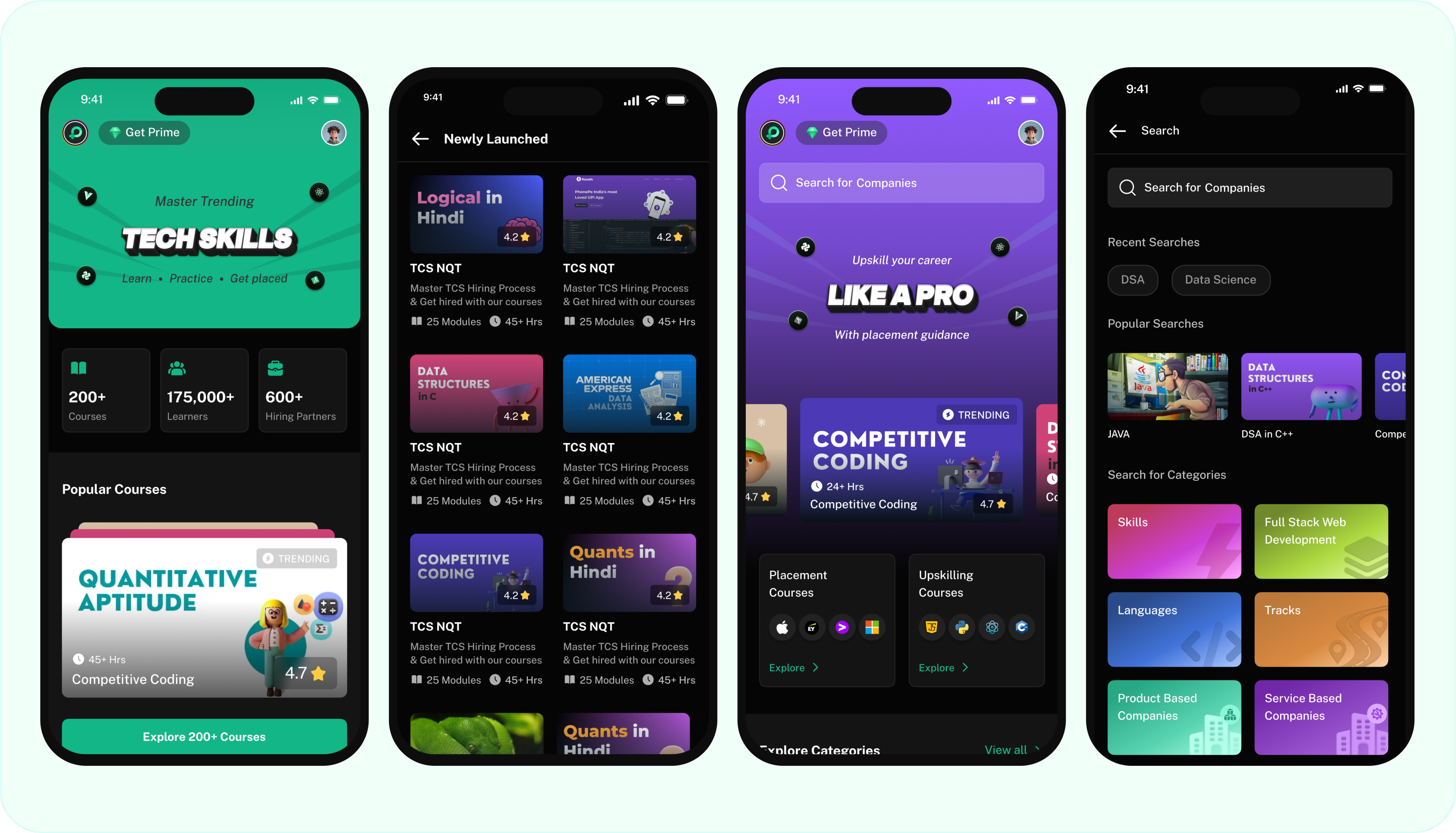
Finding the right course, at a glance
Home dashboard leads with a clear next action ("Like a Pro" placement guidance), followed by trending and category shortcuts. Search and "Newly Launched" give two more direct paths in when a learner already knows what they want.
Category pages
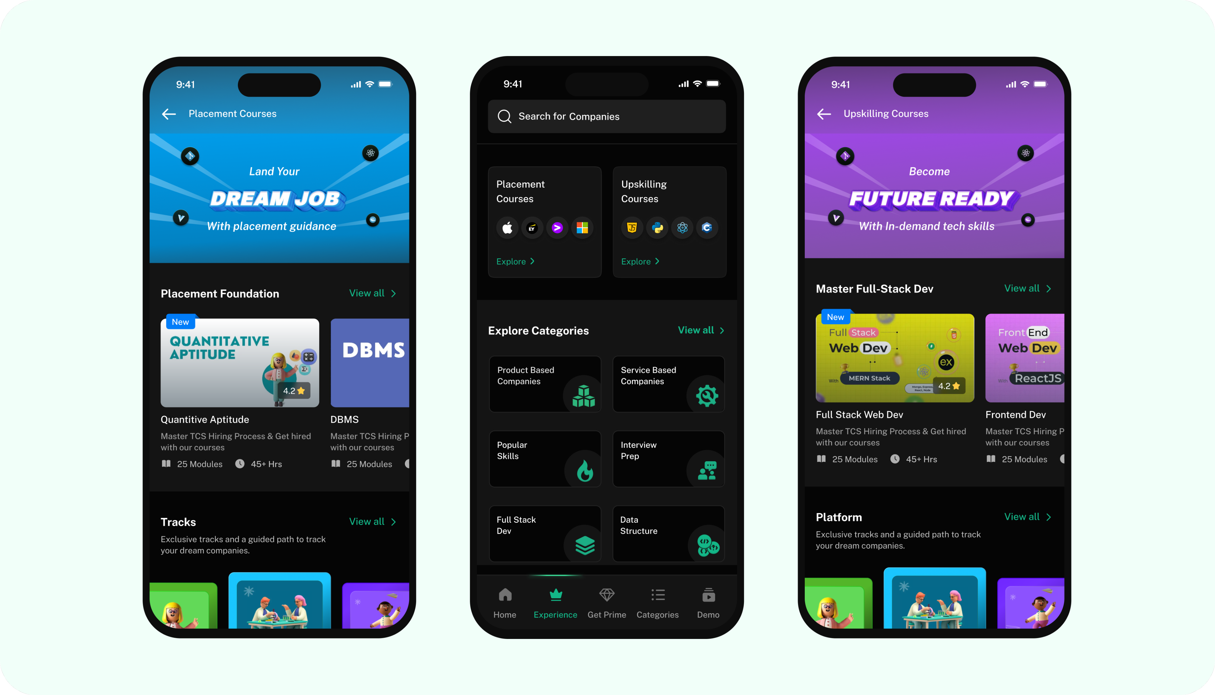
Placement vs. upskilling - split at the top, not buried in a filter
The two things learners actually come for - placement prep and upskilling - get their own landing pages with a distinct visual identity, each broken into a foundation track and a browsable course grid.
Course page hierarchy
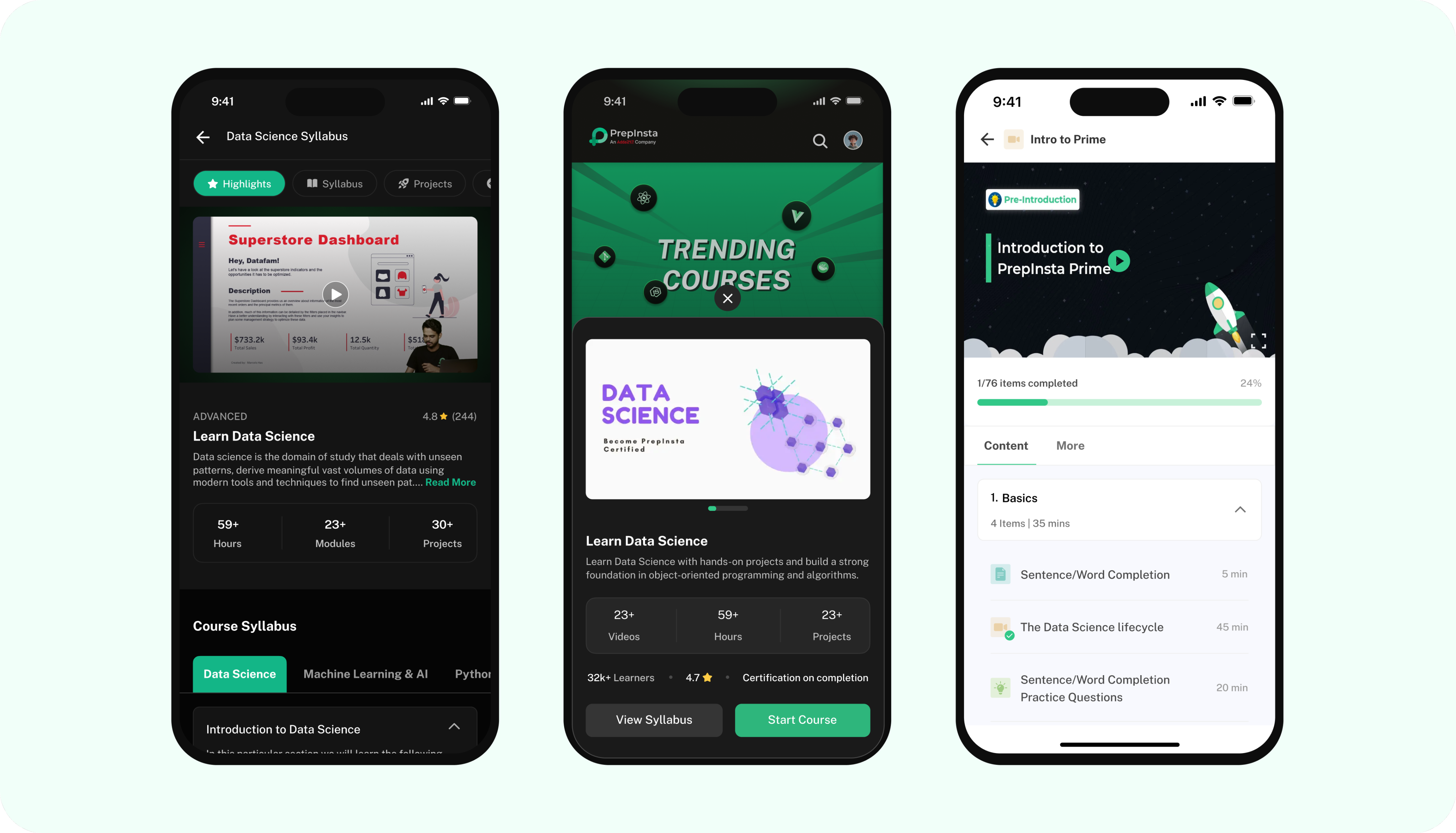
Curriculum, benefits, and action - clearly separated
Course pages restructured so the "why this course" (highlights, stats, syllabus tabs) and "start this course" (module list, progress) decisions don't compete for attention.
Practice & mock tests
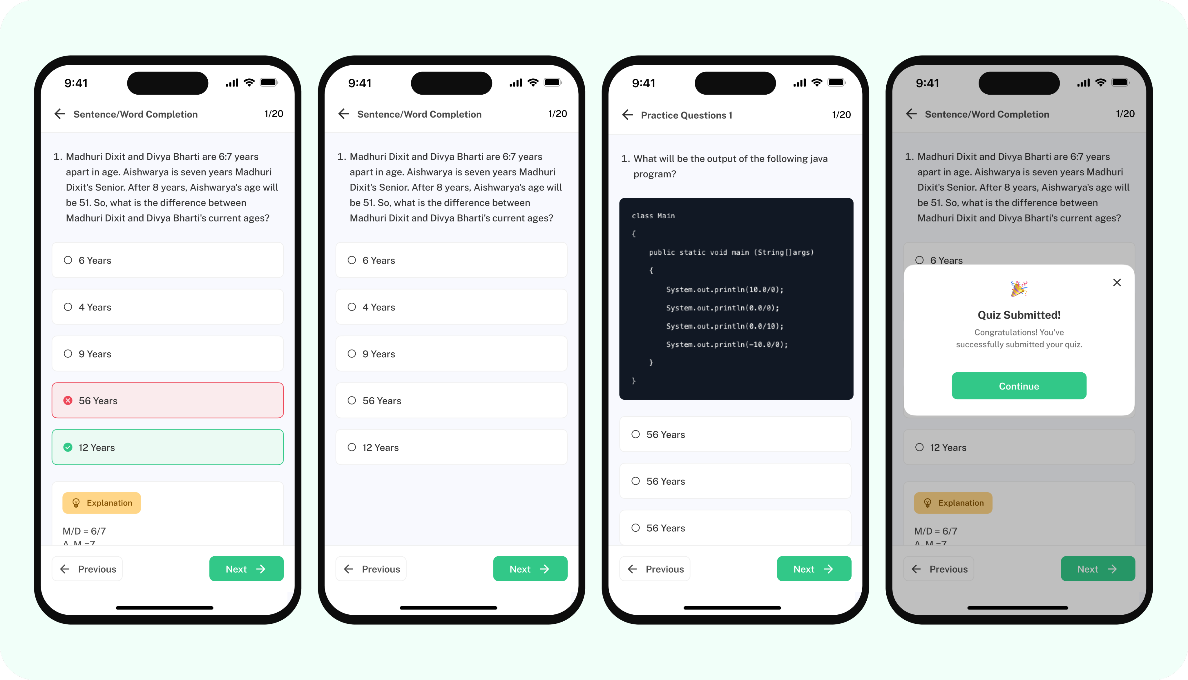
Immediate feedback, not just a score at the end
Mock test and practice questions show the right answer and a short explanation the moment a learner submits, instead of waiting until a final report, including dedicated support for code-based questions.
Profile & account
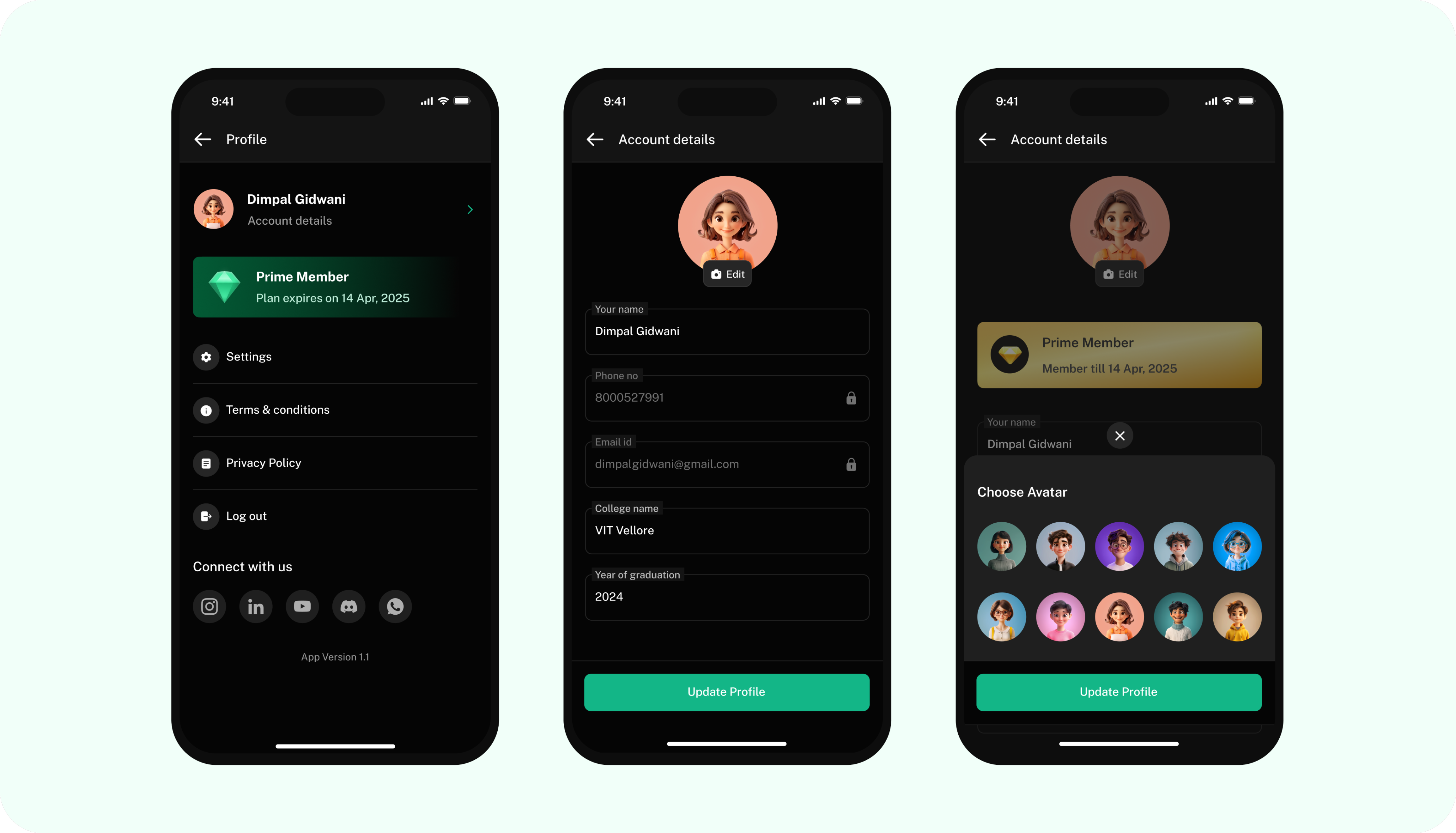
Account management that stays out of the way
Profile, account details, and avatar selection kept simple and separate from the learning flow.
Prime membership
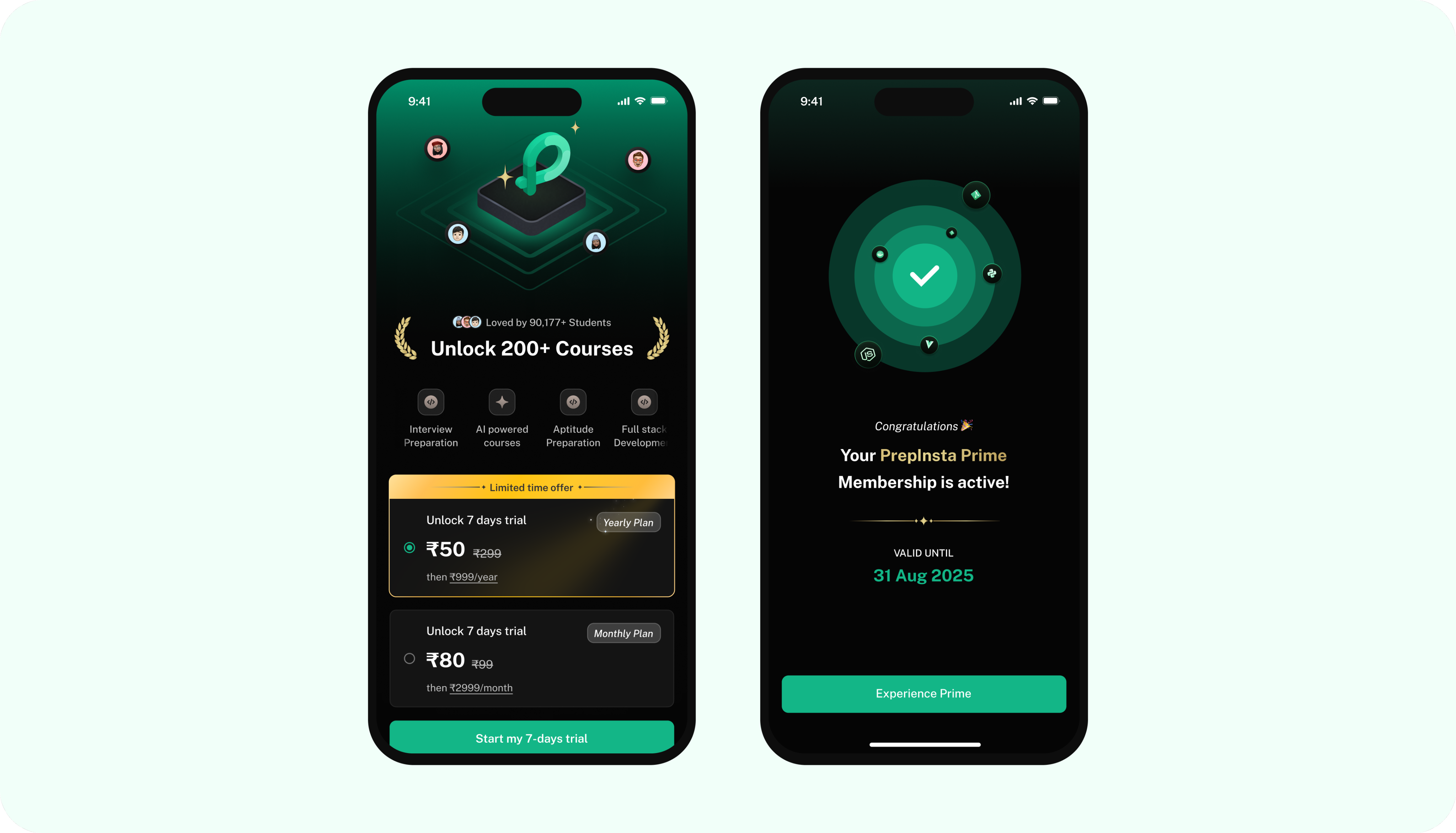
One clear plan, one clear moment to convert
The paywall leads with a single low-friction offer — a 7-day trial at ₹50 — instead of opening on a full pricing table, with a monthly option available right below for anyone who'd rather skip the trial. Once a learner converts, activation is confirmed clearly: no second-guessing whether it went through.


Business Impact
As product lead, I was accountable for the full experience post-launch, the app and category redesign, plus the payment and upgrade flow built on top of it. Within the first quarter of launch, the redesign drove:
12%

Purchase conversion rate
24%
CTA click-through rate
By combining gradual feature discovery with a structured upgrade page, the experience helped turn user engagement into measurable business outcomes.
"Study guides are easy to publish. A learner who knows exactly what to open next - that's the hard part."


Sooooo,
what’s next?
You can Email me

Find me on LinkedIn

Take Another Tour

Dimpal Gidwani
Designed and built by Dimpss
©All rights reserved


Close
PrepInsta Prime App
Industry
EdTech, Career Prep
My Role
Product Designer
Deliverables
Mobile App
Creative Direction
View Product
10M+ learners were on the platform. Most couldn't find where to start. Here's how we fixed that.
PrepInsta Prime is a modernized coding preparation hub built for placement interviews - mock tests, practice tracking, interview prep, and roadmap guides, all in one place. The content was strong. Getting to it wasn't. This is how I redesigned the app around one goal: help a learner walk in, know exactly what to do next, and stick with it.


10M+
Learners served through the platform

2.25L+
Placements recorded

4.8/5
App Store rating
The problem wasn't the content.
PrepInsta Prime already had the thing most EdTech products spend years trying to build: real content, at real scale — coding practice, placement preparation, and certification programs used by millions of students preparing for interviews.
What it didn't have was a mobile experience that respected how someone actually uses a prep app: in short, scattered bursts — a few minutes between classes, late at night before a placement drive, in the back of an exam hall queue. Users needed a way to quickly discover the right course, see their own progress at a glance, and stay motivated enough to come back tomorrow.
That's the brief I designed against: structure, personalization, and momentum.
Three moves. Each one earned its place.
I designed the PrepInsta Prime app experience around usability, personalization, and learner engagement. Rather than redesigning everything at once, I focused on three specific layers of the experience — each solving a distinct part of why learners were dropping off.
1.
A clearer information architecture
Rebuilt how courses, modules, and paths relate - so learners see their track and what's next, not a flat list of 200+ courses.
2.
Better hierarchy on course pages
Curriculum, benefits, and actions clearly separated - starting or resuming a course takes one glance
3.
Improved navigation patterns
Reworked how learners move through the app to get to learning resources faster - fewer taps between "I want to practice" and actually practicing.
Design Showcase
A look at the full app experience - onboarding, course discovery, category pages, course detail, practice and mock tests, profile management, and the Prime paywall.
Onboarding Screen
Getting a learner to their first course, faster
Designed first-run flow - email sign-in, mobile number verification, and a short profile setup (year of passing) - so a learner reaches a relevant track in a few taps instead of landing on an empty dashboard.
Course discovery
Finding the right course, at a glance
Home dashboard leads with a clear next action ("Like a Pro" placement guidance), followed by trending and category shortcuts. Search and "Newly Launched" give two more direct paths in when a learner already knows what they want.
Category pages
Placement vs. upskilling - split at the top, not buried in a filter
The two things learners actually come for - placement prep and upskilling - get their own landing pages with a distinct visual identity, each broken into a foundation track and a browsable course grid.
Course page hierarchy
Curriculum, benefits, and action - clearly separated
Course pages restructured so the "why this course" (highlights, stats, syllabus tabs) and "start this course" (module list, progress) decisions don't compete for attention.
Practice & mock tests
Immediate feedback, not just a score at the end
Mock test and practice questions show the right answer and a short explanation the moment a learner submits, instead of waiting until a final report, including dedicated support for code-based questions.
Profile & account
Account management that stays out of the way
Profile, account details, and avatar selection kept simple and separate from the learning flow.
Prime membership
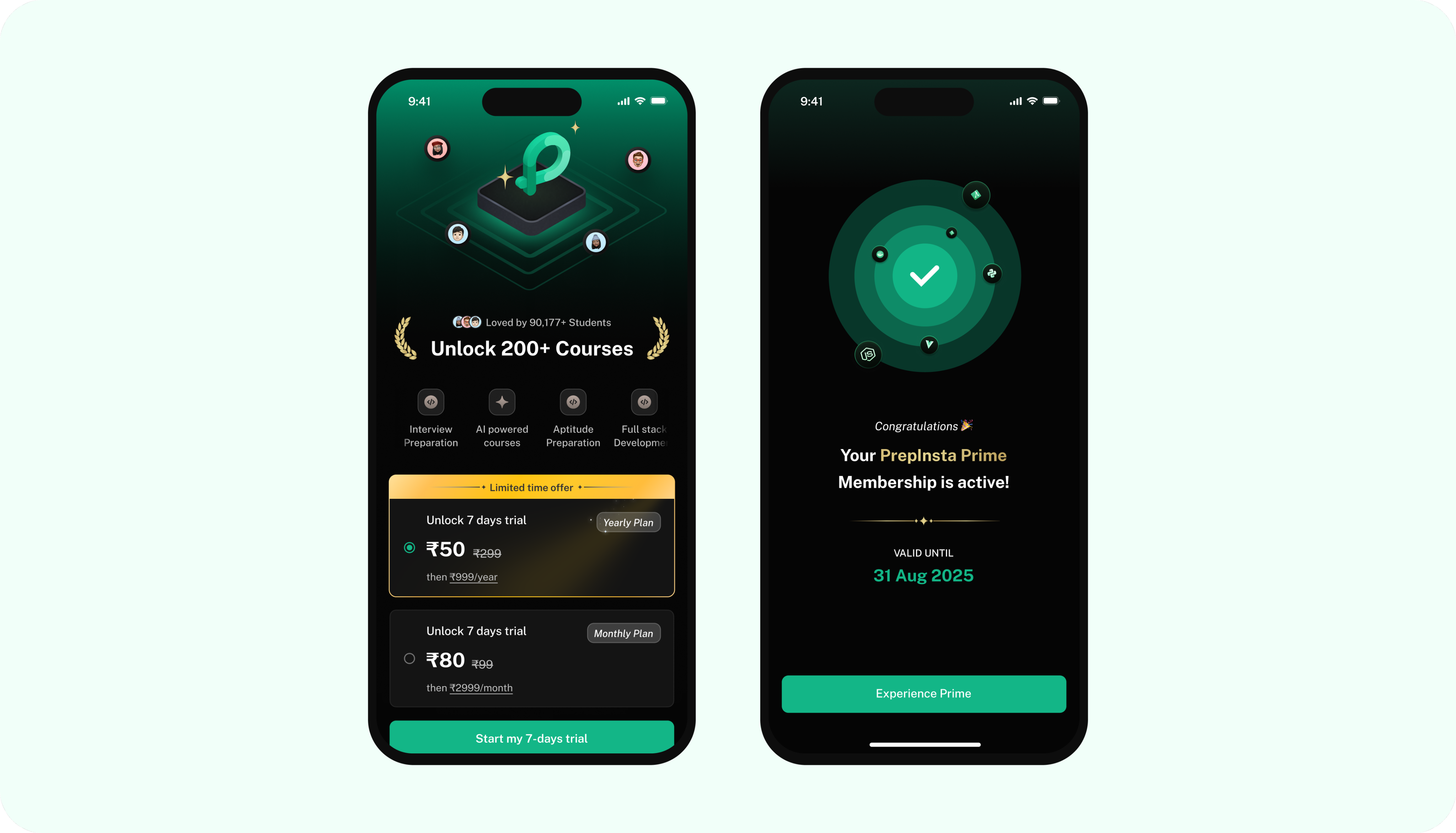
One clear plan, one clear moment to convert
The paywall leads with a single low-friction offer — a 7-day trial at ₹50 — instead of opening on a full pricing table, with a monthly option available right below for anyone who'd rather skip the trial. Once a learner converts, activation is confirmed clearly: no second-guessing whether it went through.
Business Impact
As product lead, I was accountable for the full experience post-launch, the app and category redesign, plus the payment and upgrade flow built on top of it. Within the first quarter of launch, the redesign drove:
12%
Purchase conversion rate
24%
CTA click-through rate
By combining gradual feature discovery with a structured upgrade page, the experience helped turn user engagement into measurable business outcomes.
"Study guides are easy to publish. A learner who knows exactly what to open next - that's the hard part."


Sooooo,
what’s next?
You can Email me

Find me on LinkedIn

Take Portfolio Tour

Dimpal Gidwani
Designed and built by Dimpss
©All rights reserved
PrepInsta Prime App
Industry
EdTech, Career Prep
My Role
Product Designer
Deliverables
Mobile App
Creative Direction
View Product
Close
10M+ learners were on the platform. Most couldn't find where to start. Here's how we fixed that.
PrepInsta Prime is a modernized coding preparation hub built for placement interviews - mock tests, practice tracking, interview prep, and roadmap guides, all in one place. The content was strong. Getting to it wasn't. This is how I redesigned the app around one goal: help a learner walk in, know exactly what to do next, and stick with it.




10M+
Learners served through the platform

2.25L+
Placements recorded

4.8/5
App Store rating
The problem wasn't the content.
PrepInsta Prime already had the thing most EdTech products spend years trying to build: real content, at real scale — coding practice, placement preparation, and certification programs used by millions of students preparing for interviews.
What it didn't have was a mobile experience that respected how someone actually uses a prep app: in short, scattered bursts — a few minutes between classes, late at night before a placement drive, in the back of an exam hall queue. Users needed a way to quickly discover the right course, see their own progress at a glance, and stay motivated enough to come back tomorrow.
That's the brief I designed against: structure, personalization, and momentum.
Three moves. Each one earned its place.
I designed the PrepInsta Prime app experience around usability, personalization, and learner engagement. Rather than redesigning everything at once, I focused on three specific layers of the experience — each solving a distinct part of why learners were dropping off.
1.
A clearer information architecture
Rebuilt how courses, modules, and paths relate - so learners see their track and what's next, not a flat list of 200+ courses.
2.
Better hierarchy on course pages
Curriculum, benefits, and actions clearly separated - starting or resuming a course takes one glance
3.
Improved navigation patterns
Reworked how learners move through the app to get to learning resources faster - fewer taps between "I want to practice" and actually practicing.
Design Showcase
A look at the full app experience - onboarding, course discovery, category pages, course detail, practice and mock tests, profile management, and the Prime paywall.
Onboarding Screen
Getting a learner to their first course, faster
Designed first-run flow - email sign-in, mobile number verification, and a short profile setup (year of passing) - so a learner reaches a relevant track in a few taps instead of landing on an empty dashboard.
Course discovery
Finding the right course, at a glance
Home dashboard leads with a clear next action ("Like a Pro" placement guidance), followed by trending and category shortcuts. Search and "Newly Launched" give two more direct paths in when a learner already knows what they want.
Category pages
Placement vs. upskilling - split at the top, not buried in a filter
The two things learners actually come for - placement prep and upskilling - get their own landing pages with a distinct visual identity, each broken into a foundation track and a browsable course grid.
Course page hierarchy
Curriculum, benefits, and action - clearly separated
Course pages restructured so the "why this course" (highlights, stats, syllabus tabs) and "start this course" (module list, progress) decisions don't compete for attention.
Practice & mock tests
Immediate feedback, not just a score at the end
Mock test and practice questions show the right answer and a short explanation the moment a learner submits, instead of waiting until a final report, including dedicated support for code-based questions.
Profile & account
Account management that stays out of the way
Profile, account details, and avatar selection kept simple and separate from the learning flow.
Prime membership
One clear plan, one clear moment to convert
The paywall leads with a single low-friction offer — a 7-day trial at ₹50 — instead of opening on a full pricing table, with a monthly option available right below for anyone who'd rather skip the trial. Once a learner converts, activation is confirmed clearly: no second-guessing whether it went through.
Business Impact
As product lead, I was accountable for the full experience post-launch, the app and category redesign, plus the payment and upgrade flow built on top of it. Within the first quarter of launch, the redesign drove:
12%
Purchase conversion rate
24%
CTA click-through rate
By combining gradual feature discovery with a structured upgrade page, the experience helped turn user engagement into measurable business outcomes.
"Study guides are easy to publish. A learner who knows exactly what to open next - that's the hard part."
Sooooo,
what’s next?


You can Email me
Find me on LinkedIn
Take Portfolio Tour
Dimpal Gidwani
Designed and built by Dimpss
©All rights reserved
PrepInsta Prime App
Industry
EdTech, Career Prep
My Role
Product Designer
Deliverables
Mobile App
Creative Direction
View Product
Close
10M+ learners were on the platform. Most couldn't find where to start. Here's how we fixed that.
PrepInsta Prime is a modernized coding preparation hub built for placement interviews - mock tests, practice tracking, interview prep, and roadmap guides, all in one place. The content was strong. Getting to it wasn't. This is how I redesigned the app around one goal: help a learner walk in, know exactly what to do next, and stick with it.
10M+
Learners served through the platform
2.25L+
Placements recorded

4.8/5
App Store rating
The problem wasn't the content.
PrepInsta Prime already had the thing most EdTech products spend years trying to build: real content, at real scale -coding practice, placement preparation, and certification programs used by millions of students preparing for interviews.
What it didn't have was a mobile experience that respected how someone actually uses a prep app: in short, scattered bursts — a few minutes between classes, late at night before a placement drive, in the back of an exam hall queue. Users needed a way to quickly discover the right course, see their own progress at a glance, and stay motivated enough to come back tomorrow.
That's the brief I designed against: structure, personalization, and momentum.
Three moves. Each one earned its place.
I designed the PrepInsta Prime app experience around usability, personalization, and learner engagement. Rather than redesigning everything at once, I focused on three specific layers of the experience — each solving a distinct part of why learners were dropping off.
1.
A clearer information architecture
Rebuilt how courses, modules, and paths relate - so learners see their track and what's next, not a flat list of 200+ courses.
2.
Better hierarchy on course pages
Curriculum, benefits, and actions clearly separated - starting or resuming a course takes one glance
3.
Improved navigation patterns
Reworked how learners move through the app to get to learning resources faster - fewer taps between "I want to practice" and actually practicing.
Design Showcase
A look at the full app experience - onboarding, course discovery, category pages, course detail, practice and mock tests, profile management, and the Prime paywall.
Onboarding Screen
Getting a learner to their first course, faster
Designed first-run flow - email sign-in, mobile number verification, and a short profile setup (year of passing) - so a learner reaches a relevant track in a few taps instead of landing on an empty dashboard.
Course discovery
Finding the right course, at a glance
Home dashboard leads with a clear next action ("Like a Pro" placement guidance), followed by trending and category shortcuts. Search and "Newly Launched" give two more direct paths in when a learner already knows what they want.
Category pages
Placement vs. upskilling - split at the top, not buried in a filter
The two things learners actually come for - placement prep and upskilling - get their own landing pages with a distinct visual identity, each broken into a foundation track and a browsable course grid.
Course page hierarchy
Curriculum, benefits, and action - clearly separated
Course pages restructured so the "why this course" (highlights, stats, syllabus tabs) and "start this course" (module list, progress) decisions don't compete for attention.
Practice & mock tests
Immediate feedback, not just a score at the end
Mock test and practice questions show the right answer and a short explanation the moment a learner submits, instead of waiting until a final report, including dedicated support for code-based questions.
Profile & account
Account management that stays out of the way
Profile, account details, and avatar selection kept simple and separate from the learning flow.
Prime membership
One clear plan, one clear moment to convert
The paywall leads with a single low-friction offer — a 7-day trial at ₹50 — instead of opening on a full pricing table, with a monthly option available right below for anyone who'd rather skip the trial. Once a learner converts, activation is confirmed clearly: no second-guessing whether it went through.
Business Impact
As product lead, I was accountable for the full experience post-launch, the app and category redesign, plus the payment and upgrade flow built on top of it. Within the first quarter of launch, the redesign drove:
12%
Purchase conversion rate
24%
CTA click-through rate
By combining gradual feature discovery with a structured upgrade page, the experience helped turn user engagement into measurable business outcomes.
"Study guides are easy to publish. A learner who knows exactly what to open next - that's the hard part."
Sooooo,
what’s next?
You can Email me
Find me on LinkedIn
Take Portfolio Tour
Dimpal Gidwani
Designed and built by Dimpss
©All rights reserved